Van

XTREME1

RIP
Joined
Nov 13, 2006
Messages
9,681
Location
Ma
Name
Greg Crowley
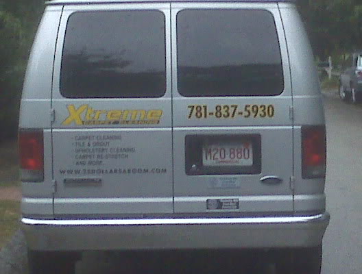
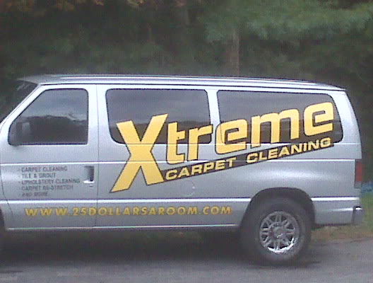
I went with lettering because it was a hassle with the wrap but I have 2 vans and a car lettered this week and monday I will post all the pics soon. The box truck is going to continue old design because it would be too much to upgrade. I need advice on shirts. Right now black polos with the green and orange xtreme

It is pouring rain and taken from a cell phone but you would believe how crisp it is
IMG00031.jpg

_DeviceMemory_home_user_pictures_IMG00038.jpg

IMG00036.jpg
 

-JB-

Member
Joined
Oct 26, 2006
Messages
5,387
Location
here
Name
JB
like the new logo design, looks a lil less X-rated than the ole one..... like you care what i think. !gotcha!
 

Brian R

Member
Joined
Jun 13, 2008
Messages
19,945
Location
Little Elm, TX
Name
Brian Robison
Looks like they did a good job. 1000 Xs better than the old logo.

When are you going to fix your website?
 

Ryan

Member
Joined
Jun 29, 2009
Messages
2,415
I like it. As with all wraps and lettering I'm sure it looks 10x more impressive in person.
 

Becker

Member
Joined
Oct 8, 2006
Messages
7,359
Location
Snohomish, WA
Name
Becker
Looks good. Yellow is my fav color. Logo much better. Now here're than mine and fresh air.

Problem with the yellow besides the main logo is it gets washed out easy at a distance.
Shows in the pics. But maybe better live.

On a past van I had some lettering redone because of the wash out.

Nice work.
 

Latest posts

Back
Top Bottom