Ross Buettner
Member
I was going to do:
company logo
residential and commercial
Upholstery
grout and tile
Phone number
Any other advice?
company logo
residential and commercial
Upholstery
grout and tile
Phone number
Any other advice?
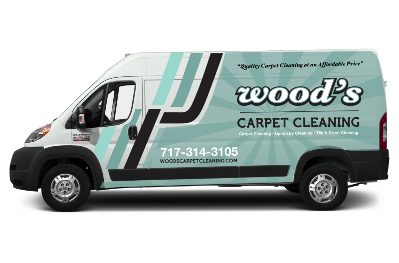
Have it wrapped like Saiger's are or don't bother. Women don't look at white vans. In fact they turn their heads away. Now some women on here are going to say they look at trucks but that is because they are in business with them. I've been at this for 15 years including 2 years with Stanley and 1 year for someone else with a big ugly orange van. I watch people constantly when I'm driving and I'm telling you, women do NOT look at white lettered vans.
I have a whit 2010 express. I was told to stick with black, and maybe another color shadowing it.

I like that!White works for me. Graphics by Ryan Keates.

I'll assume you mean me?Very nice!
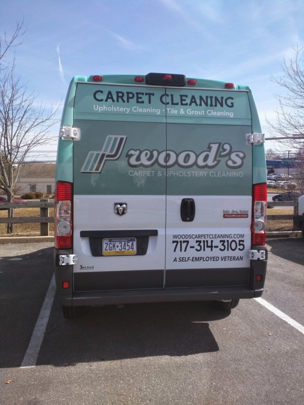
can we see the back?
Thanks! I get a lot of compliments on it.Looks great Bob!
What's JMA?Thats a JMA wrap.
I take it that's a good thing? Jim Martin is someone important?
Bulletin Board Carpet Cleaner?What the hell is a bbcc?