Vehicle Wrap

CanadianRuss

Supportive Member
Joined
Jul 27, 2015
Messages
265
Location
Ontario, Canada
Name
Russ Teskey
What do you guys think? I think a few changes are needed.
 

Attachments

  • image.jpg
    image.jpg
    84.2 KB · Views: 290
  • image.jpg
    image.jpg
    97.4 KB · Views: 299

Russ T.

Supportive Member
Joined
Sep 26, 2008
Messages
3,556
Location
Slater, IA
Name
Russ Terhaar
What's the company name?

I don't like lists to be on the van. They probably aren't readable from very far away. Maybe just my preference.

Looks pretty cool though, I like the soap bubbles!
 
  • Like
Reactions: CanadianRuss

CanadianRuss

Supportive Member
Joined
Jul 27, 2015
Messages
265
Location
Ontario, Canada
Name
Russ Teskey
What's the company name?

I don't like lists to be on the van. They probably aren't readable from very far away. Maybe just my preference.

Looks pretty cool though, I like the soap bubbles!
Company name is The Stain Expert.
I appreciate your input, these are just drafts. I think I agree with you on lists
 
  • Like
Reactions: Russ T.

Russ T.

Supportive Member
Joined
Sep 26, 2008
Messages
3,556
Location
Slater, IA
Name
Russ Terhaar
I'd feature your Logo BIG on each side. I see the website on the back now.

I'd use that list space on the back to push your brand.

I bet there will be plenty more ideas in no time.
 

Total_Rookie

Member
Joined
Jan 28, 2013
Messages
537
Location
Beaumont, CA
Name
Joseph Torrez
I would not do it, your marketing would cause me stress. I just think your promising too much. I understand you want to work. But consumers are fickle and are not always easy to please.
 

ruff

Member
Joined
Apr 19, 2007
Messages
11,010
Location
San Francisco, CA
Name
Ofer Kolton
Russ,
I like it. It needs work.
I consider vinyl lettering more of a billboard when you're parked at the work place and in town and less so when you're on the freeway. A design to catch the eye while one is zooming down the freeway will be quite different than when you're mostly stationary.

A good graphic design ties all elements together and makes the eye of the viewer go where you want it to go. In other words convey your message in the most advantageous way.
  • Currently, your company name is not standing out and is not graphically tied to what you do.
  • No need to repeat "cleaning" after every single item you do. They get it. List the things you want them to know and cleaning at the end.
  • Your back door has more information than the sides while it has less space. Does not make sense. Not saying that sides should have more. The less that conveys your message the better.
  • I am not sure what your 200% guarantee means but frankly it seems excessive. On the other hand if it helps your business, who knows.
  • The blue oval does not work with the design, the rest is clean and it makes it cluttered.
  • Personally and I am sure there are many here who will disagree, I am sick of the generic cute female and adorable baby pictures. I doubt that they help (regardless of the oodles of research) and they are way over used. Doesn't pedophiles.com have it on all their vans?
 
Last edited:
  • Like
Reactions: Russ T.
Joined
Jul 15, 2011
Messages
470
Location
New Port Richey, FL
Name
Ross Martin
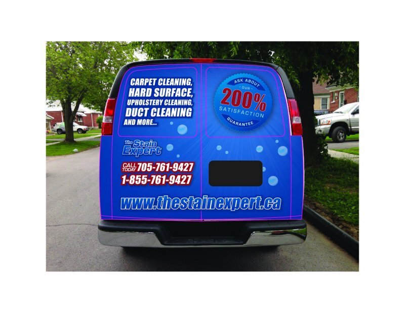
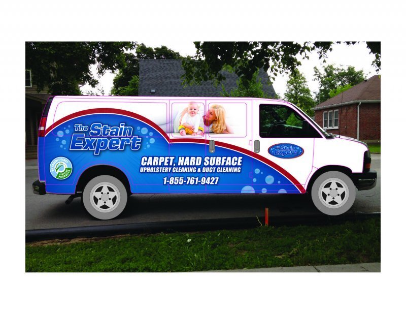
I think you need to put what you do and how to contact you towards the roof. And larger. Car parked next to you are in traffic and no one will see your contact info.

Pretty picture below that.

Overall a clean, readable wrap.

And what desk jockey said about blue logo/blue background.
 

Latest posts

Back
Top Bottom